In the ever-evolving realm of online business, it’s crucial to have a website that not only boasts an eye-catching design but also runs smoothly on every type of device.
That’s where responsive WordPress themes come into play – they’re like the game-changers that can elevate your business to new heights.
These WordPress themes are purposefully crafted to adapt seamlessly to various screen sizes, ensuring that your audience enjoys an exceptional user experience.
In this blog, we’ll introduce you to the best WordPress responsive themes that have the potential to transform your website into a formidable online presence. So, let’s jump right in!
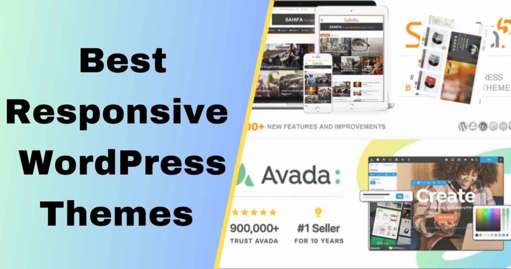
1. Avada – Responsive Multi-Purpose Theme

Avada is a powerhouse that caters to virtually any website’s needs. With its incredible flexibility, Avada suits e-commerce sites, portfolios, corporate blogs, and more.
Thanks to its user-friendly drag-and-drop page builder, customization is a breeze. Avada boasts an extensive library of pre-built designs.
Fusion Builder, an intuitive visual page builder, offers even more flexibility. Its responsive and adaptable design guarantees a smooth experience on every device, and the inclusion of WooCommerce makes online selling easier.
Key Features:
- Drag-and-drop page builder for easy customization.
- An extensive library of pre-built designs.
- Fusion Builder is a user-friendly visual page builder that’s easy to use and understand.
- It’s wordpress responsive design for a seamless mobile experience.
- WooCommerce integration for effortless online selling.
2. Quanto – Responsive Business WordPress Theme

Quanto is the epitome of professionalism for businesses aiming to establish a strong online presence.
Its clean and modern design offers a pristine canvas to showcase products or services, and its built-in live customizer allows real-time design adjustments.
Quanto offers various header and footer styles, as well as options for parallax and video backgrounds to give your website a modern touch.
Plus, it’s designed with SEO in mind to boost your search engine rankings. Its responsive layout ensures that your site delivers a seamless user experience across all devices.
Key Features:
- Built-in live customizer for real-time design changes.
- Multiple header and footer styles for customization.
- Parallax and video background options for a modern touch.
- SEO-optimized for better search engine rankings.
- Responsive and mobile-friendly layout.
3. WoodMart – Responsive WooCommerce WordPress Theme
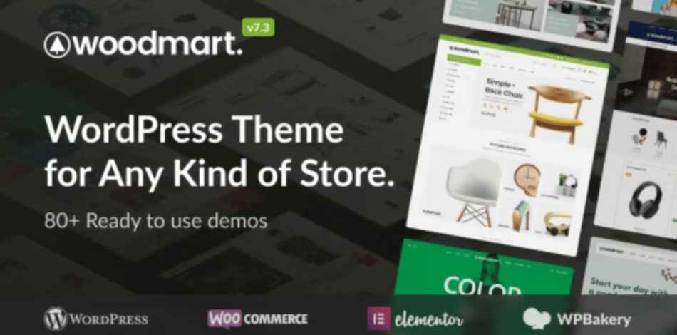
For e-commerce entrepreneurs, WoodMart is a game-changer. Tailor-made for WooCommerce, it ensures that your online store looks exceptional and functions seamlessly across all devices.
Woodmart multipurpose WooCommerce theme’s extensive customization options provide a wide range of theme settings, and its AJAX filters create a smooth shopping experience.
Key Features:
- ou can personalize it to your liking with a variety of theme options.
- Built-in AJAX filters for a seamless shopping experience.
- Extensive typography options for branding.
- Product quick view and wishlist functionality.
- Mobile-optimized design for increased conversions.
4. Go Portfolio – Responsive WordPress Portfolio Theme

Creative professionals and artists seeking to showcase their work should look as far as Go Portfolio. This mobile-friendly WordPress theme offers a responsive platform that elegantly displays your portfolio.
It provides multiple portfolio layouts and styles, a drag-and-drop portfolio builder for easy organization, AJAX-powered page transitions for a seamless user experience, and a retina-ready design for high-quality visuals.
Smooth scrolling and parallax effects add a modern touch, making Go Portfolio perfect for creative individuals.
Key Features:
- Multiple portfolio layouts and styles to choose from.
- Drag-and-drop portfolio builder for easy organization.
- AJAX-powered page transitions for a seamless user experience.
- Responsive design for high-quality visuals.
5. Sahifa – Responsive Blog Theme

In the realm of content creation, Sahifa reigns supreme for news, magazine, and blog websites. Its responsive design ensures that your articles and stories are accessible to readers across all devices.
Sahifa’s robust theme options panel simplifies customization, while sticky sidebars and mega menus enhance navigation.
With unlimited color options for branding, and a highly responsive layout for optimal readability, Sahifa empowers content creators to shine in the digital world and create a responsive wordpress website.
Key Features:
- A robust theme options panel for easy customization.
- Mega menus and sticky sidebars.
- Built-in review system for rating articles.
- Unlimited color options to match your branding.
- Highly responsive layout.
Conclusion
In the competitive world of online business, your website serves as the crucial initial connection between you and your audience. Selecting the perfect responsive WordPress theme can significantly impact your ability to attract and retain visitors.
Each of the above-mentioned themes comes equipped with a range of powerful features that will empower you to create a website that not only looks impressive but also functions seamlessly on desktop computers, tablets, and mobile devices.
Your website functions as your digital storefront, and with one of the best mobile-friendly WordPress themes, you can truly stand out in the crowded online marketplace.
So, there’s no need to delay any further. Choose one of the responsive themes that aligns with your business objectives.