Did you know that it takes about 0.05 seconds for users to form an opinion about your website, and 94% of those initial judgments are design-related? Elementor, the intuitive website builder, becomes the artisan’s tool, empowering creators to fashion visually captivating and functionally seamless websites.
With over 8 million active installations globally, Elementor has become the preferred choice for designers and developers alike, revolutionizing the way we bring our digital dreams to life.
In a groundbreaking shift, the Elementor WordPress plugin has replaced the traditional sections and columns with a powerful new building block—the Flexbox Container.
This paradigm shift might seem daunting at first, but fear not! In this guide, we’ll unravel the mysteries of the Elementor Flexbox Container, exploring its capabilities and demonstrating how it can revolutionize your website design.
I. What is a Flexbox container in Elementor?
A Flexbox container in Elementor is a layout tool that allows you to create more flexible and responsive web pages. It is based on the CSS Flexbox layout module, which provides a more powerful and versatile way to arrange elements on a page than the traditional float-based layout methods.
With Flexbox containers, you can control how elements are aligned, distributed, and sized within a container. You can also easily create responsive layouts that adapt to different screen sizes and devices.
Container Varieties:
The Elementor Flexbox Container comes in two versions: “flexbox” and “grid.” While the latter is still in development, we’ll focus on the stable and versatile flexbox version in this guide. As Elementor progresses, we’ll explore the grid version in a future tutorial.
1. Boxed vs. Full-Width Containers:
Inside the Flexbox Container, you can opt for a “boxed” or “full-width” layout. While “boxed” is the default setting, it may not be optimal for most containers. Understanding the nuances of these options is crucial for achieving the desired layout for your content.
2. Widget Width and Alignment:
Widgets within the Flexbox Container also have width settings, akin to the container itself. Manipulating widget width and alignment provides further control over your design. Remember, the align-items feature affects widget alignment, not the content within them.
II. What are the advantages of Flexbox?
There are many benefits of using Flexbox containers in Elementor such as:
- More flexibility: Flexbox containers give you more control over how elements are arranged on a page. You can align elements horizontally or vertically, distribute them evenly or spaced apart, and control their size and proportions.
- More responsiveness: Flexbox layouts are inherently responsive, meaning they will adapt to different screen sizes and devices without you having to write any additional code. This makes it easier to create websites that look great on all devices.
- Cleaner code: Flexbox containers generate cleaner and more efficient code than traditional float-based layouts. This can improve the performance of your website and make it easier to maintain.
Some of the things you can do with Elementor Flexbox containers are :
- Create responsive columns and rows.
- Center elements horizontally or vertically.
- Distribute elements evenly or spaced apart.
- Stretch elements to fill the available space.
- Hide elements on certain screen sizes.
- Create complex layouts with nested containers.
III. Why should you use the Flexbox Container?
For years, we’ve been accustomed to the familiarity of sections and columns, but the Flexbox Container introduces a new era of flexibility and efficiency.
Although the learning curve may take some time to navigate due to the plethora of options, the payoff is immense—faster websites and an expansive range of design possibilities.
It’s a paradigm shift, requiring us to unlearn old habits and delve into the expansive realm of possibilities that this container unfolds. The learning curve is worth it, though, as it promises faster websites and an array of design options.
IV. How to Use Elementor Flexbox Container (Simple Steps)
Elementor Flexbox Container is a new feature that was introduced in Elementor 2.6. It allows you to create more responsive and flexible layouts. In this article, we will show you how to use Elementor Flexbox Container in easy steps.
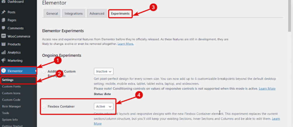
Step 1: Activate Flexbox Container in Elementor Experiments.
- From the WordPress dashboard, navigate to Elementor ⇒ Settings.
- Under the Experiments tab, enable the “Flexbox Container” option.
- Click on the “Save Changes” button.
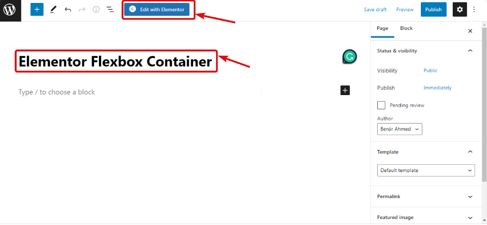
Step 2: Create a new page.
- From the WordPress dashboard, click on Pages > Add New.
- Enter a title for your page and click on the “Publish” button.
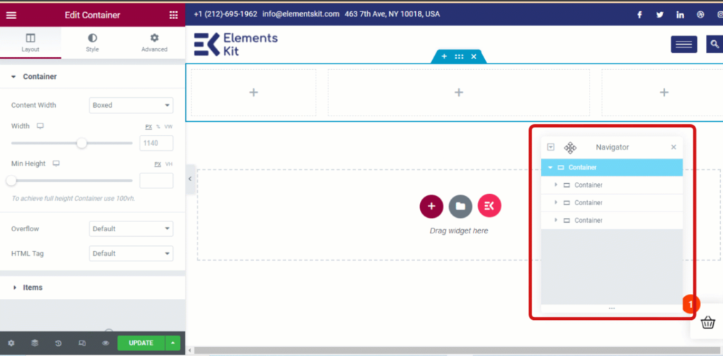
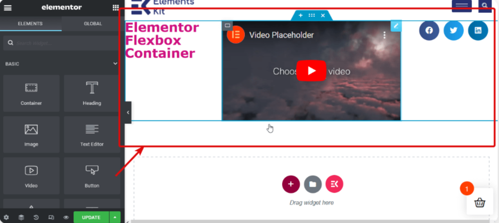
Step 3: Add a container.
- Click on the “+” icon in the Elementor panel.
- Search for “container” and click on the “Container” widget.
- Drag and drop the container widget to the desired location on your page.
Step 4: Add widgets.
- Click on the “+” icon inside the container.Select the widgets you want to add.Drag and drop the widgets to the desired location inside the container.
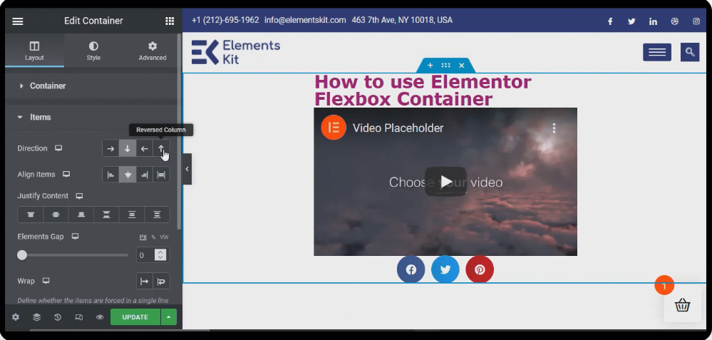
Step 5: Customize container contents.
- Click on the container to open its settings panel.
- Under the Layout tab, you can customize the following settings:
- Direction: Choose whether you want the widgets to be arranged horizontally or vertically.
- Justify Content: Choose how the widgets should be aligned horizontally.
- Align Items: Choose how the widgets should be aligned vertically.
- Gap: Set the spacing between the widgets.
- Advanced: This tab gives you more control over the flexbox layout, such as the ability to set flex-grow, flex-shrink, and flex-basis for each widget.
Step 6: Save your changes.
Click on the “Update” button to save your changes.
V. Tips and tricks for using Elementor Flexbox Container:
- You can nest containers inside each other to create more complex layouts.
- You can use the “Convert to Flexbox Container” option to convert existing sections into Flexbox containers.
- You can use the “Style” tab to style the container and its contents.
1. Responsive Design Tricks:
Learn how the Flexbox Container handles responsive design, particularly with the order and wrapping features. Discover how these attributes can simplify your layout, eliminate the need for excessive containers, and streamline your design process.
2. Additional Features and Tips:
Uncover some handy features, such as the order attribute for responsive mode and insights into dealing with the default padding. We’ll also discuss the option of keeping old websites in sections and columns, converting them, or rebuilding from scratch.
Conclusion
The Elementor Flexbox Container heralds the future of design with its unparalleled versatility, enabling seamless responsiveness across devices. Its dynamic properties empower designers to craft layouts that adapt effortlessly to evolving user experiences.
As web design trends continue to prioritize flexibility and user-centric layouts, Elementor’s Flexbox Container stands as a beacon of innovation, offering limitless possibilities for tomorrow’s digital landscapes.
Embracing this feature ensures designs that transcend boundaries, setting new standards for intuitive and adaptive web experiences.
Embrace the Flexbox Container as your new design ally in Elementor. This guide promises to equip you with the knowledge to leverage the container’s full potential.
Happy designing!